by Maria Misiura
As a scientist who spent 6.5 years in grad school, I have seen my fair share of posters. I’ve seen posters that use too much ink, posters that contain too much detail, not enough detail, and even the occasional entertaining one. I’ve seen the good, the bad, and the cringy.
I should start by introducing my limited credibility which makes me (somewhat) qualified to write this post. During my undergrad studies, my roommate majored in graphic design at a prestigious art college in Atlanta. We shared a mutual love of art, but while I dabbled in my artistic hobbies, she actually learned the craft. As a side hustle, I picked up some graphic design jobs making everything from logos to flyers to advertisements for a few local businesses. Before I presented anything to my clients, I always had her critique (read rip apart) my work. Through this painful process I gleaned my knowledge of basic design principles, and some super handy adobe creative suite tips. I always viewed these types of jobs as a creative outlet, but I had no idea how well these learned skills would serve me in my scientific endeavors. So, now I’m here writing this blog, hoping to pass on some of this knowledge to the next generation of scientists. I originally intended to make a list of tips, but I found that with each tip, I had more to say. There are many great poster resources online, so to make this list less run-of-the-mill, I have decided to do tips spread over the course of a few posts.
There are some great articles about making a visually appeasing scientific poster, so in my attempt to not be redundant, I decided to focus on using text and color to create hierarchy.
https://www.animateyour.science/post/best-examples-of-scientific-posters
https://www.animateyour.science/post/how-to-select-a-great-colour-scheme-for-your-scientific-poster
If anyone should find these guidelines objectionable, please email me at mmisiura1@gsu.edu. If you really convince me of the error of my ways, I may even make you a co-author on this post.
I am considering starting a “poster review”. If you have a great or terrible poster, send it to me and you may just see it on the blog.
Using Text to create a sense of hierarchy
Hierarchy allows the eye to move fluidly across your poster. The best designers use carefully chosen typography and sometimes color to create hierarchy.
What should stick out? The poster title and your name are the most important elements that the viewer’s eye should first see. I think affiliations are often over emphasized in the titles, as not everyone is always familiar with your affiliation or those of your co-authors. Depending on the conference, your co-authors may be important, or not. At a regional conference where you intend to meet others in your area and explore research opportunities, your co-authors may be important (“Oh, you work for XYZ? They are so great, we should collaborate.”), but at a large international conference, your co-authors and affiliations might not be as relevant. Choose how large you would like to display your subheadings to ensure that achieve a good balance between showcasing your work and the effort of authors, and delivering a concise, powerful message in your poster.
Here are some examples of ways that I have created hierarchy using text.
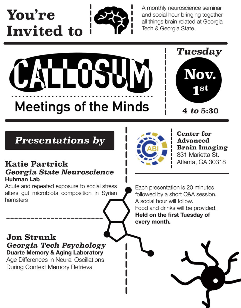
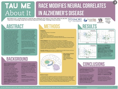
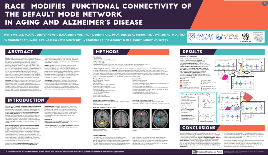
Choosing a typeface
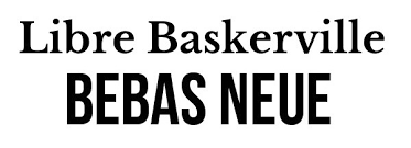
I like to limit my total poster typeface choices to 3, a title face, a body face, and (pro-tip: font is used to describe a whole font family (i.e. Arial), and a typeface, is a face within that family (i.e. Bold). You aren’t limited to fonts in Microsoft powerpoint. Whether you are using canva, indesign, or my nemesis powerpoint (to be fair, it has come a long way in terms of usability for this purpose), there are generally ways to upload your own fonts. Canva utilizes many google fonts, that you can often find for free to download if you ever decide that you want their fonts on your own machine. Your university may have a subscription to Adobe fonts, and they have some options that I like for readability. There are a variety of websites that offer free fonts, but be warned, my IT dept informed me that free fonts are common carriers of viruses, and we have all had our fair share of live viruses these past couple of years. You want to ensure that you also create hierarchy using different typeface sizes. I wouldn’t go any smaller than 18 pt font for the body text of your poster, but that looks different depending on the typeface, so print out a sample on a small piece of paper if you are unsure.
On the right are some typefaces that I think go well together, with a link to some more font pairings.
I also look up font pairings on canva or pinterest, and these types of pairings typically have fonts that are not too similar, and so create visual contrast which can in turn help create hierarchy.
I suggest that your title be a bigger, bolder typeface (please no script typefaces, they are too hard to read)
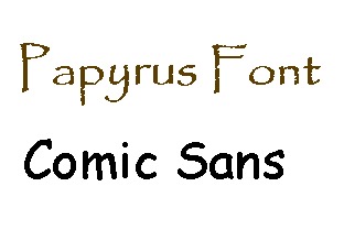
Please don’t ever use these typefaces, they remind us millennials that we are getting older as we used to use them for book reports in middle school, and that feels like a long time ago. More importantly, their readability isn’t that great, and they look slightly unprofessional IMHO.
Using Color
Using color can be a great way to harmonize the elements of your poster and create hierarchy. I suggest limiting yourself to 2-3 colors. If I’m feeling uninspired, I go to pinterest and look at color schemes, or check out example flyers or presentations on canva for ideas. If this topic really interests you, check out this post from inside design about the different types of colors schemes: https://www.invisionapp.com/inside-design/quick-guide-color-palette/.
Keep in mind that cool colors recede from your eye, and warm colors come forward, so carefully choose your tints and shades based on this principle. I have heard some people suggest that you use colors from your institution or university. I don’t follow this rule because no one outside your region will really know what those colors represent and be able to recognize your work accordingly. Plus, it’s limiting and (I think) boring. This website is great for picking color schemes:
If you are getting your work printed by your department, always check their rules about color use in posters. This will help you avoid unnecessary grumbling from your IT peeps about your color background and wasted ink, and in turn make your life easier. See below for a poster that I made for such an occasion. However, if your advisor likes you and has grant money to afford to get your work printed on fabric, you can be more liberal with your color use.
In the posters above, you can see that I stuck with three to four colors max, and repeated my color pallet throughout the poster. Below you can see a primarily black and white color pallet and a complimentary color pallet.

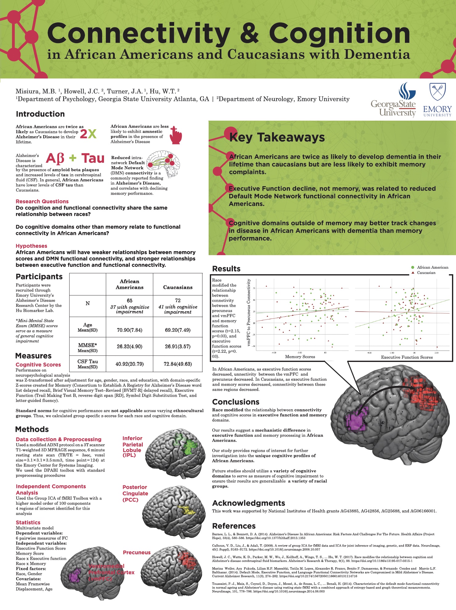
A word of caution: Objects on screen are lighter than they appear. Colors typically print darker than on your monitor. Be sure to create contrast between your background color and your text for maximum readability. If using a variable width font (one in which the width of the letters changes) I would not suggest using it on a dark background. The print resolution usually won’t match what is on the screen and the thin parts of your light letters will end up getting lost on a dark background
On colorblindness: I read an article recently about the improvements in technology for those with colorblindness. On electronics, color blind individuals can apply a variety of filters to alter their displays, and I have read that many color-blind people use such tools making it less of a consideration for virtual formats (https://www.ryobi.co.jp/products/visolve/en/, https://www.thewindowsclub.com/computer-software-color-blindness) . However, in-person this presents a bit of a different issue, and you should consider making a color scheme that accommodates color blindness.
If this is something about which you are truly passionate, you can check out Color oracle, that helps you pick color-blind friendly color schemes. I have never used so I’m not sure how it works. https://colororacle.org/manual.html


